Vexed! Magazine before and after improvements to my front cover, contents page & double page, responding to social networking feed back & my own analysis of each page as well.
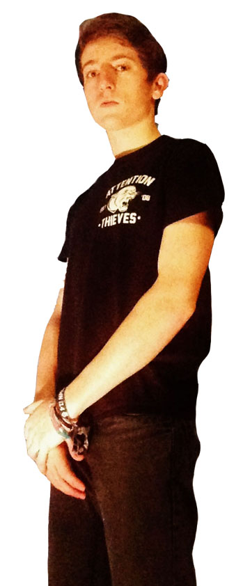
Front Cover Before: After:


After uploading my front cover to Facebook I received detailed feedback from different people about what they liked and what they thought could be changed in order to improve my magazine and make it look more professional. Firstly, one piece of feedback stated that the ‘WIN’ feature within the footer did not stand out and was extremely difficult to read and therefore they suggested changing it. In response to this comment I changed the footer to a lighter grey so that the ‘WIN’ feature stood out a lot more and additionally made the picture of the drum skin smaller and overlapped the footer to make it look more professional like other magazines of the genre did as well. I also changed the flash and made it a lot smaller because it was too big compared to other examples I looked at and studied. I added a big cover line to my magazine to make it adhere to the typical conventions more and I put this towards the bottom right hand corner so it didn’t overlap the model too much and was very prominent. Lastly, I made the date of the magazine a lot smaller and I also moved the barcode and price of the magazine right to the bottom of my magazine onto the footer so it was not so visible and did not stand out as much.
Contents Page Before: After:


I uploaded my contents page to Facebook and after receiving feedback I have made some changes to improve it and make it look more professional. One of the pieces of feedback I received was to change the colour of the date to a different colour to make it stand out more, they suggested changing it to black but instead I chose white still showing continuity of colour pallet and house style as well. I also changed the font of the different subheadings, still keeping them bold and stand out but making them different to the title of the page, I also added an effect around the edge of the text as well. I changed the font of ‘CONTENTS’ so it was not the same as the institutional logo ‘VEXED!’ this was something I thought would improve my magazine greatly as I have noticed it on already existing magazines too. Additionally, I added more information under each of the ‘OTHER ARTICLES’ headings to give the reader more insight into what they’re going to be reading and I also adjusted the font styles and sizes of this section to make it all stand out more and split it all up better. Furthermore, I changed the size of the editor’s letter so that the font was different and was a lot smaller because it was taking up far to much of the contents page, it was too prominent. Lastly, I adjusted the size of the institutional logo in the bottom left hand corner because it was too big and I added a website link on the subscribe feature to make it easier for the reader to subscribe to the magazine.
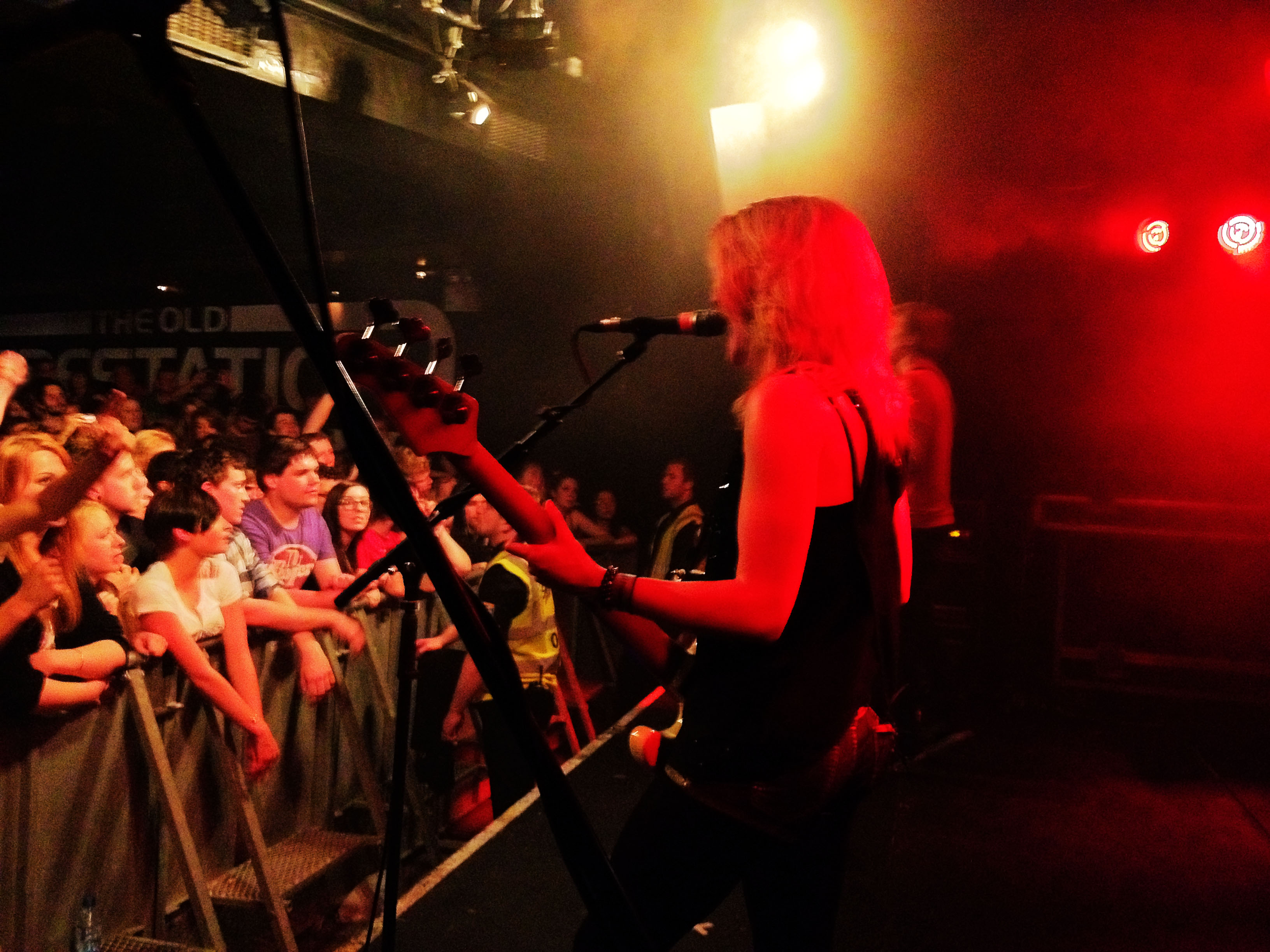
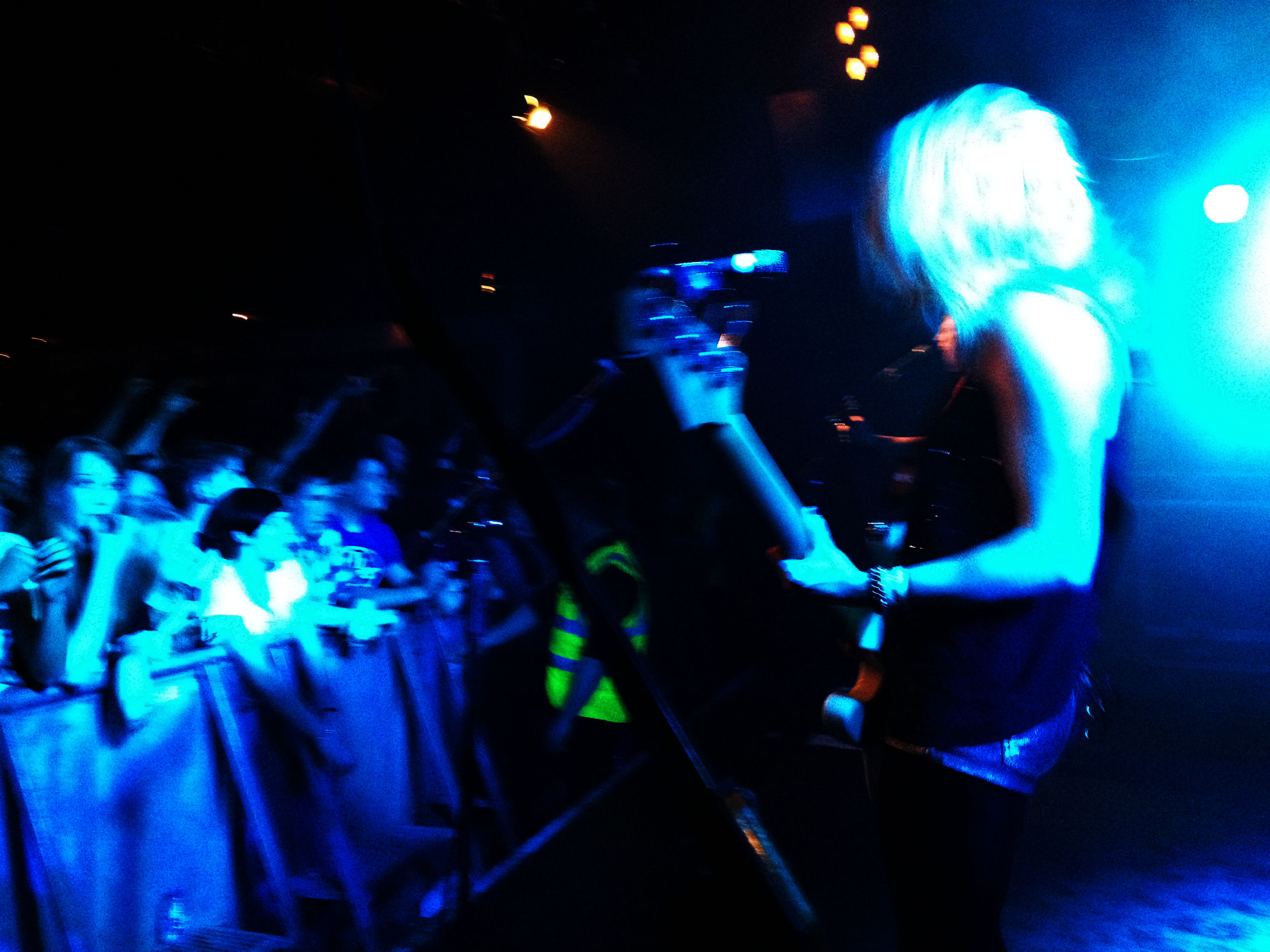
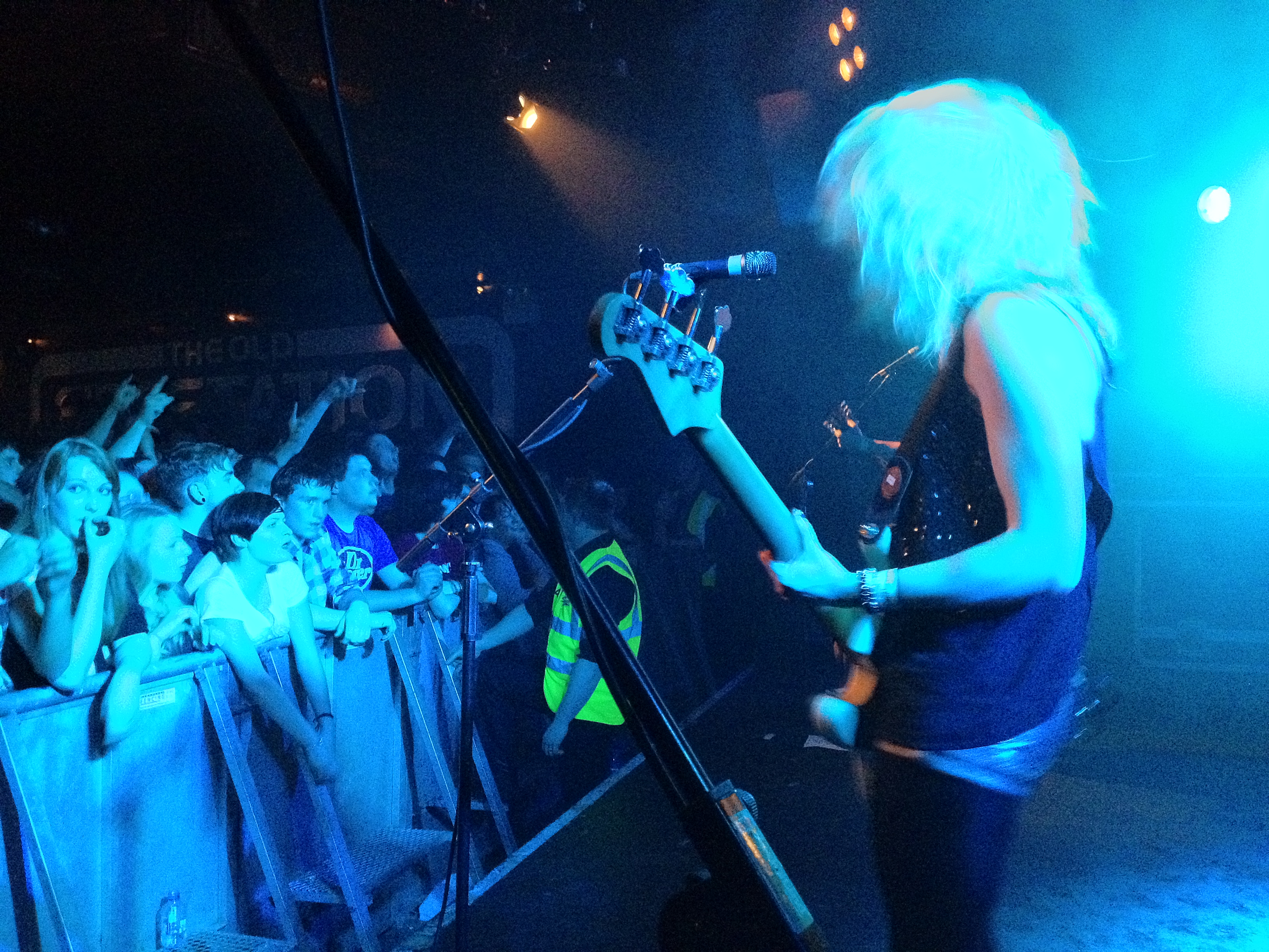
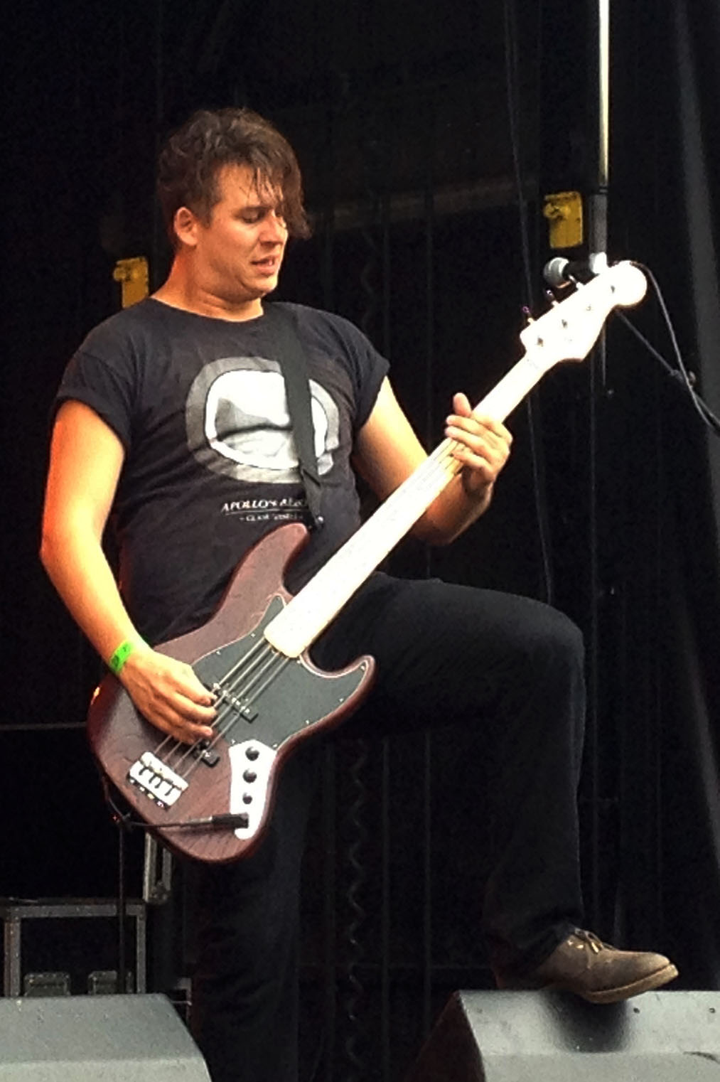
Double Page Spread Before: After:


After uploading my double page spread to Facebook I received some feedback with different ways it could be improved to make it look more professional or just to alter a couple of small things to make it look a bit better. Firstly, I changed the size of the page number in the bottom right hand corner because it stood out too much and looked unprofessional. Additionally, I then changed the font of ‘THE SCREAMING DEAD’ title because it was too similar to my institutional logo, but I ensured it still stood out and was very bold. In addition, I added a drop capital to the beginning of my article like well-known magazines do and I also made the font a lot smaller because it was too big when looked at closely and therefore I re-organised all the columns and added some more information into my article as well as added another quote directly from the band member to attract the readers more and pull them in. Furthermore, I changed the wording of some of the article to ensure it appealed to a teenage / young adult rock music audience and was not too formal.