Evaluation Question #7

Looking back at your preliminary task, what do you feel you have learnt in the progression from it to the full product?
PrelimTask  Front Cover
Contents Page  Contents Page
Since creating my preliminary task I have improved skills I already had and gained a lot of new ones when using different websites, software and technology in the process of creating my final music magazine.

Researching into already existing magazines:
 One of the key things that made my final product a lot better than my preliminary task was the research and planning I did before I started creating my product. The reason this helped me was because it allowed me to see what my audience would like and what they wouldn’t like and also what they thought was good ideas and what they thought was a bad idea. When creating my preliminary task I had done no research and planning and therefore I had no idea whether the audience of my magazine would like it or not.

When researching and planning for my music magazine I completed an extreme amount of research into already existing music magazines so that I knew what the typical forms and conventions of music magazines of the rock genre contain and are.
dps  dhhx  ghgh  Front Cover Analysis 2 - NME
I chose my genre as being rock music and therefore I looked into already existing magazines such as Kerrang! because they had a similar target audience to what my own product was going to have and they included similar things to what I had in mind. I then analysed different front cover, contents pages and double page spreads to see what their layout was like and what features and conventions they included in their magazines.

I also looked into the other aspects of a magazine. For example Kerrang! who also have a website, twitter page, Facebook account, Kerrang! awards etc. Therefore I decided to create my own aspects like this for my Vexed! magazine. I created a Twitter, Facebook, Ingram and YouTube accounts. Additionally, I added Vexed! sessions, Vexed! online and Vexed! awards as well. This was something I hadn’t thought of or considered when creating my preliminary task and only thought of this when creating my final product because I had researched into the product beforehand.

After researching into these different parts of already existing magazines I was then able to make my magazine look professional because they followed many of the different conventions and features that magazines such as Kerrang! include as well.

Researching into target audience:
When I as making my preliminary task I never really thought about who I was making the magazine for. Whereas with my final music magazine product I did consider the target audience because I had done previous research into the target audience. I found that doing this was very useful because it enabled me to ensure that my magazine appealed to them all and had content that they wanted to read and see. I involved my target audience when completing the research and planning by completing questionnaires and focus groups. Additionally I used them throughout the production stage by asking for feedback on social networking sites too. Everything they asked me to change or add I did because I wanted my magazine to appeal to them and cater for their needs and wants.

Researching into the images used in magazines:
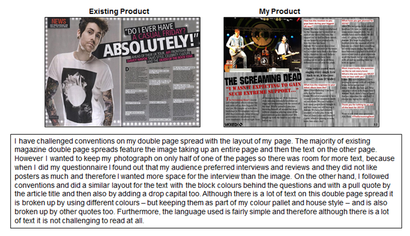
My preliminary task only used one image and it’s not as good as it could have been. This is because I didn’t really think or consider this when completing my school magazine. However after looking at already existing magazines I was able to see what type of images they used and included. This meant I was able to consider, the audience, costumes, props, facial expressions and body language, mise-en-scene, and also the representations of the models as well.

Additionally, I learnt that the more photographs you take the better because you are able to choose the best ones and eliminate the rubbish ones. When I started editing the photographs for the front cover I was able to see which ones look better.

Overall, I have learnt that it is vitally important to research and plan before you create a final product. This is because it enables you to look into different aspects of the magazine before you start. I was then able to develop and gain a greater understanding of different technologies and skills and I now understand the process of making a music magazine a lot more than I did when I created my preliminary task.

 Creating Drafts & Receiving Feedback:
As part of the production process for my magazine I created drafts.
Front Cover d1    Contents Page d1   Double Page Spread d1
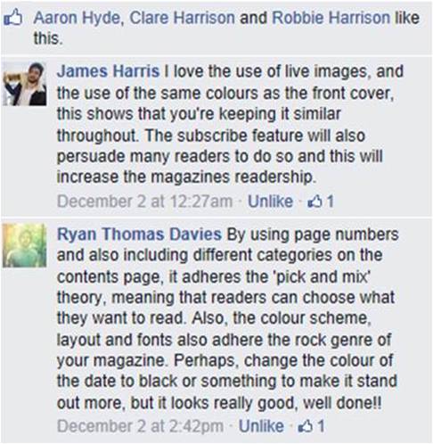
First, they were just drafts of my initial ideas on layout and colour etc. I then formed a focus group with these drafts and received feedback on what members of my target audience liked and what they thought could be improved. Once I had this feedback I then began creating my actual magazine. Throughout the entire process I was constantly receiving feedback from members of my target audience as well as other people including teachers. This allowed me to gain an understanding of what people liked and what they thought could be altered to make it look more professional and I did this several times before reaching my final product. I used social networking such as Facebook to receive feedback as well as verbal feedback as well. This is something I didn’t think of doing previous to creating my preliminary task but was very helpful in understanding what my target audience wanted.

Devloping My Skills:
When creating my final magazine I spent a lot of time manipulating and editing my photographs ready for their use in my magazine. I edited the brightness and contrast as well as cropping the photo down as well. I also used several different tools on Adobe Photoshop to remove the background of my photographs as well. I didn’t do this to as high of standard when creating my preliminary task and therefore this made my final product look more professional.

Additionally, I also used external websites to create different font styles to use within my final product. I did this to make my magazine look more professional because many already exisitng magazines do this as well. Also, it allowed me to link my magazine in with the genre too, because the cracked distorted font was connoting the rock genre. This is not something I did on my preliminary task and therefore it was a lot more basic and not as eye-catching.

Evaluation Question #6

What have you learnt about technologies from the process of constructing this product?
Whilst creating my magazine I have used a huge variety of different technologies, these different technologies include:
Wordle 1

WordPress: I used WordPress which is a blogging website to upload and present all my work. I used this to show all my work from the Research and Planning through to the Production and even the Evaluation as well. It was an easy website to use and it was easy to edit and add to if needed.
Wordpress
YouTube: I used this website to upload my videos too. It was easy to register my account and then it was a simple process to upload my videos to the website. It also gave me the option to make my video private so that only people who had the link via my blog could view it. I did this for my focus group video.
Youtube
Microsoft PowerPoint and Word: I used PowerPoint to create my mood boards for my ideal readers and target audiences because it was easy to move and place different photographs. Additionally, I used Word to create my Questionnaire and also I used it to analyse some of my already existing music magazines during the research and planning stage as well.
Word Powerpoint
Internet Explorer & Google Chrome: I used these two internet browsers to complete my research and planning as well as use them to access my blog and upload all my work on a regular basis.
internet explorer google chrome
Wordle: I used this website to present my questionnaire results and findings in a unique and different way. I used another Wordle during my evaluation (shown above) as well to list all the different technologies I used within my production.
Wordle
Facebook & Social Networking Sites:  I used different social networking sites including Facebook to upload my product too. I did this so that different members of my target audience were able to give me feedback on what they liked and didn’t like about my magazine. By using social networking I was able to take into consideration what different members of my target audience wanted and needed from my product and therefore it allowed me to create a final magazine that interested and attracted my audience. It was very important that I listened to the feedback I was given at each stage.
Facebook    Double Page Spread FB Feedback   Contents Page FB feedback
Adobe Photoshop: I used Photoshop to edit all my photographs for my magazine front cover, contents page and double page spread. This piece of software can be hard to use and can take a while to get used to however once I understood all the different features I was able to manipulate my images and make them look very professional. I used it to change the lighting and also to remove backgrounds of the photographs or remove unwanted parts of the image too.
photoshop  IMG_2751    IMG_27512Back
Prezi: I used this website as a different and unique way of presenting my work. I used this mainly to present different PowerPoint presentations within my work and it allowed me to embed them directly into my blog.
prezi
iPhone 5S: I used this to take videos of my focus group as well as take the photographs of my models and of my inside images too. This enabled me to upload the images straight to my laptop and edit them. By taking my own photographs I was able to represent my models how I wanted them to be represented. I was able to use the props, costume, body positioning, facial expressions and lighting that I wanted to use.
apple
Laptop/Computers: These played a big part in my work as I used them not only to edit my photographs but also to upload work to my blog and also complete work as well.
Laptop Computer

Evaluation Question #5

How did you attract/ address your audience?
Within my magazine production I involved my target audience in several different ways throughout, allowing them to have an input and help me get my magazine to its final stage, ensuring that it appeals to my audience and meets their wants and needs. I did this through methods such as, Facebook & Social Networking comments/feedback, Questionnaires and also Focus Groups as well.

Questionnaire:
Questionaire
I began by making a questionnaire for members of my target audience to answer. I did this very early on in the research and planning stage and this therefore enabled me to find out what things they wanted me to include in my magazine, what magazines they already read, what bands they liked, what type of rock music they listened to, how often they attended festivals and gigs, how much they’d pay for my magazine and additional questions on font styles and colour too.

By completing this questionnaire I was able to make sure the information I included in my magazine was what my target audience wanted to see. It also allowed me to address the appearance and layout of my magazine, taking into consideration what my potential audience wanted it to look like. Here is a link to the questionnaire results I obtained: https://emilyyharrison.wordpress.com/2014/11/12/music-magazine-questionaire/

Focus Group:
Another stage within my research and planning I held a focus group containing three members of my target audience – male and female aged between 16-19 years old. I pitched them the basic layout and idea for my magazine and asked them what their opinion was, on the name, layout and content as well. They compared my magazine drafts to already existing magazines of the genre (Kerrang!) and asked them what they liked about each and what they thought could be improved to make it better/ more professional.

By holding the focus group it really helped me find out exactly what my audience wanted in and from  my magazine, additionally what they wanted the layout to be and what they wanted to find within it too. I took into consideration what was said during this focus group and tried my best to address all of their comments too.
Here is a link to my focus group:
https://emilyyharrison.wordpress.com/2014/10/27/magazine-focus-group/
Here is a link to my focus group findings:
https://emilyyharrison.wordpress.com/2014/10/27/focus-group-key-findings/

Facebook & Social Networking Feedback:

Once I had completed my magazine drafts using found images I sent the images too some members of my target audience via Whats App and received feedback on what they liked and what could be improved. Therefore, when creating my final product with my own images I made sure I addressed all their suggestions and feedback to make it better and more professional.
IMG_2714  IMG_2716  IMG_2715   IMG_2713
Once I had completed my final product I then uploaded my front cover, contents page and double page spread to Facebook and different members of my target audience commented what they liked and what they thought could be improved to make them better. This was the feedback I received from my target audience:
FB Feedback FC  FB Feedback CP
FB Feedback DPS
How my magazine appeals to the ideal reader:
How does the front cover appeal to you?
“It shows someone of a similar age as the cover model, representing them positively, it also gives an insight into what is included within my magazine e.g. interviews, reviews, articles, competitions, quotes etc which are things I am interested in and things that I want to see.”

How does the contents page appeal to you?
“The contents page gives me more information on what is included and instantly I can see that all the things included are things I want to see and read about. The colours used are intriguing and eye-catching and the layout is simple and easy to look at”

How does the double page spread appeal to you?
“It looks professional and eye-catching, this is due to the colours used and the layout chosen as well. There is not too many pictures/the picture does not take up too much room and therefore the focus is the text. It is very informative, yet the language used is not too complex, it’s got a sense of humor too.  I like the image used too”
Front Cover  Contents Page  Double Page Spread
Overall, I have included all the different aspects that my target audience wanted, I have also stuck to what they liked about the layout and content and I made my product look as professional as possible, therefore I believe that my product attracts my target audience of 16-26 year old teenagers/young adults.

I have attracted my audience by including a flash which offers them free information which acts as a unique selling point as well as including a footer which also includes a WIN feature. These both attract the audience to my magazine because they involve them and they feel as if they’re getting things that they wouldn’t with other magazines.  Furthermore, I included a subscribe feature offering the readers discount on the magazine and I also included the content that they asked for.

I included interviews and reviews as well as free content and gig guides as well. This was what my target audience wanted when I held my questionnaire. Also, the colours used and the fonts used were ones my audience informed me they wanted and would look good on my magazine. Moreover, the photographs are eye-catching and bright and they reach out to the audience immediately. They are of bands and artists within the genre of music that they like and therefore it addressed them and their needs.

Evaluation Question #4

Who would be the audience for your media product?

My magazine is aimed at a teenage and young adult audience between the ages of 16-26. I aimed to produce a magazine that would appeal to as wide demographic as possible as i could and I did this by ensuring that my magazine appealed to both genders and was not gender specific. For example by using my main colour pallet and house style as red, black, white and grey I have catered for both males and females and none of the colours are associated with one specific gender.

Male target member    male
Ben, 18-year-old, male, studying at college for his A-Levels. He listens to a wide range of rock music from indie rock, to alternative rock and further to punk rock as well. Ben loves discovering new bands that he has never listened to and exploring their music online before purchasing albums and records. Ben attends college every day and usually spends his evenings studying, meeting friends or attending gigs or concerts. His weekends consist of very similar activities; attending festivals such as Reading & Leeds Festival, in the summer period. Ben’s choice of fashion is alternative consisting of predominantly black, white and grey.  He usually wears clothing either from alternative clothing shops such as Urban Outfitters or he shops in clothing outlets and from clothing lines such as Hype Clothing or Drop Dead Clothing. Ben also likes to spend time on his mobile or laptop to use the internet to look at upcoming gigs and tours and searching for new music on YouTube. He also uses social networking to keep up to date with his favourite bands and artists.

Reader Moodboard   image1
Lily, 21-year-old, rock music fan who is very interested in the music and media industry. She thoroughly enjoys attending gigs, festivals and concerts regularly in her spare time and enjoys going out and spending time with her friends being social. Lily spends a lot of time on the internet (when not studying, working and spending time with her friends) she enjoys reading magazine articles online as well as in weekly and monthly issues. Additionally, she aspires to the clothing, style and look of many of the ‘rock stars’ featured within the magazines she reads and she loves buying new clothing to fit in with the alternative rock style. She often shops in Urban Outfitters or Topshop. She has a part time job working for a local journalism company, but she is also studying at University as well. This means that she is in the C2DE social class bracket and the price of Vexed! magazine would be £1.75, which is a reasonable price for Lily to spend weekly on the magazine.

I asked a member of my target audience how they felt the magazine appeals to them:
“I think Vexed! magazine appeals to me because I fall within the target audience they are trying to reach, as I am 18 years old. I also feel that it appeals to me because I am interested in the genre of music that it covers. I love alternative rock, heavy rock and metal too, I like bands such as Bring Me The Horizon, A Day To Remember, Max Raptor and many others as well. I already read weekly magazines such as Kerrang! and therefore because Vexed! is weekly too I would be interested in reading it as well. I am currently studying my A-Levels at sixth form and therefore I dont have a lot of money and the price of Vexed at £1.75 is not too expensive.  I really enjoy attending gigs and festivals and therefore if Vexed! includes information on upcoming events I will be very interested in reading the magazine and will definitely buy it for the foreseeable future”

Vexed! very own mood board:
Mood Board

Evaluation Question #3

What kind of media institution might distribute your media product and why?

All magazines are distributed by a bigger, parent company known as an institution. These institutions need to be aware of their specific magazines’ target audience and they decide what the magazine is going to represent and portray. They then give different companies a brief description of the magazine so they can sell the chosen magazine to many different companies.

I think an ideal institution to distribute my music magazine would be Bauer Media Group who already distribute existing magazines including, Kerrang!. This magazine gains a hue readership every week and appeals to its audience in all the right ways. Therefore, I believe that this would be a good and ideal institution to distribute Vexed! and enable it to reach out to the right audience in order for it to become successful.
BAUER
My own institution EKH Media will be distributing Vexed! magazine because the institution specialises in rock magazines similar to Kerrang! and NME.  They are a very small institution which currently only deal with one magazine which is Vexed! who’s readership is now reaching 167,260 and grows rapidly each week. EKH Media currently works in Germany, Italy, Belgium, Poland and of course the United Kingdom. The institution was founded in 2007 and is currently in the top 20 magazine production companies in the United Kingdom.
EKH Media

The Vexed! brand ethos is:
Vexed! understands the wants and needs of Rock music fans and therefore includes news, posters, gigs and tours information, undiscovered bands, competitions and more. Vexed! informs readers about the Rock music scene and keeps all their readers up to date with the world of rock music and never keeps them in the dark. All Vexed! readers will have an interesting and exciting experience reading all the features, whether it’s an article about their favourite band or a review of the best new rock album. Additionally, Vexed! understands the different institutions they are competing with e.g. ‘Kerrang!’ and ‘NME’ and therefore they aim to be unique and will stand out among all other magazines. It offers rock music lovers a unique magazine which they will thoroughly enjoy and want to read every week.

The Vexed! mission statement is:
“Here at Vexed! we make sure that we are continually appealing to all of our readers. Every issue will include a range of different bands which will appeal to different genders, ages and social classes as well. We will focus on the most important news within the rock scene each week, including articles, interviews, posters, gig and tour guides, competitions, fan interaction and much more! We promise to never release an issue that will let you ‘Kerrang! readers down, there will always, without a doubt be a feature that’ll be of interest to each and every reader. It will keep you up to date with the rock music scene and you’ll never feel like you’re being left out!”

Along side the magazine, Vexed! will have other aspects too, including:

  • Vexed! Twitter, Facebook, YouTube and Instagram accounts – with extremely frequent updates and additional interviews and reviews that are not included within our magazine.
  • Vexed! Sessions – weekly live music sessions uploaded to our own sessions website which allows the readers and fans to watch some of their favourite bands doing an exclusive session for them.
  • Vexed! Online – the website gives even more information to the readers of the magazine through videos, articles, up to date exclusive information and music videos.
  • Vexed! Awards – an annual ceremony held in London presenting the stars of the industry with relevant awards, with the help of the readers voting!

I believe that EKH Media would work with Vexed! to ensure that it’s mission statement and ethos are met and that the magazine reaches out to the correct target audience (16-26) and that all the readers needs and wants are met too.

Evaluation Question #2

  How does your media product represent particular social groups?
The media product I have created is a music magazine named Vexed! which is aimed at teenagers and young adults aged 16-26. I think my magazine represents teenagers and young adults effectively in many different ways.

Teenagers and young adults are typically represented as lower class because they are either in education with part time jobs or they are working but in a low paid job. This tends to suggest that my target audience do not have much money. Additionally, teenagers are usually seen as being lazy and unproductive whereas my magazine challenges that becuase it shows them going out and attending gigs and concerts and going out to see friends or buy magazines etc.

I asked a member of my social group and target audience, how they felt my magazine represents them:
“I am 19 years old and I am studying for my A-Levels. I believe the magazine represents me and my social group because it includes up to date information on new music and upcoming music, shows and tours. It also has inside information, reviews and interviews with bands and artists that appeal to me and informs me about their lifestyle and gives exclusive information. I enjoy using social networking like Twitter and I feel that this magazine allows me to interact by using these websites and by using the internet in general too. I do have a part time job which enables me to pay for gigs and festivals and there is several reviews, gig guides and festival news within this magazine which informs me of whats going on around me and what is recommended as well”

More detail on the magazine itself:
Firstly, my product shows that my audience are extremely interested in new music, upcoming tours, upcoming gigs (concerts) and what’s on. They like to be kept up to date with how they can be as ‘on top’ of the music scene as possible and what they can attend in order to do this. Therefore I have shown this throughout my magazine by adding feature’s on my front cover and contents page.

Music    Picture1
Secondly, Vexed! also represents their audience by the use of ‘rock stars’ as well. They want to know about their lives, what they do daily, their individual interests and styles, so that they can develop the way they act or present themselves to relate to the band members/artists. Many people will be inspired by them playing live or by what they wear and to enable the readers to relate to the ‘rock stars’ I have shown several different artists throughout my magazine and also mentioned them too.
1  2  3
4 5
As well as liking music my audience were also very interested in social media, and they are all familiar users of Twitter, Facebook, as well as use the internet daily too. I have shown this within my product by providing a link to the featured band’s Twitter on my double page spread and also promoting the Vexed! website on the contents page with the Subscribe feature.
web   twitter
Vexed! also shows how my audience would love to own some possessions of their favourite band members as well as own some of their favourite bands merchandise too. I have displayed this in my product by including a ‘WIN’ section where they are able to win a signed drum skin and also another chance to win a large bundle of a bands merchandise.
WIN  q
Additionally, my magazine audience like to be kept up to date with news on the rock music scene and like to hear exclusively from their favourite bands and artists therefore within my magazine I have included several interviews and live reviews as well, enabling my audience to know what’s happening daily within the rock music scene, I ensure that I keep the language fairly simplistic and not too complex so that it is suitable for teens and young adults of a low-middle working class.
int rev rev int

Evaluation Question #1

In what ways does your media product use, develop or challenge forms and conventions of real media products?
During the research and planning stage of my magazine, I analysed several different already existing music magazines to gain a deeper understanding of the different conventions that were included so that when I created my own I was able to include them in my own to make it look as professional as possible.
FRONT COVER:
Front Cover Quest 1 - 1
Front Cover Quest 1 - 2
CONTENTS PAGE:
Contents Page Quest 1
When completing my research and planning I focused on what features they had in their magazines as well as what content each featured as well. Also when completing my questionnaire I asked potential readers of my magazine what they’d want to see in my magazine too. Some of the features include: Interviews, Reviews, Gig Guides, Posters, Competitions, Album Releases etc. Therefore I included some of these features within my own magazine contents page and double page spread to make it appeal to my readers and also to make my magazine professional too.
DOUBLE PAGE SPREAD:
Double Page Spread Quest 1
I stuck to the typical conventions of gender within the rock music genre within my magazine. The majority of rock magazines are predominantly male and females are a minority within this genre, therefore when creating mine I kept it very similar. I did this because this is what my audience wanted and liked because it made my magazine like existing ones and also made sure it covered similar/the same bands and artists as professional ones.

When creating my double page spread I represented the band members in a positive way, and definitely represented their lifestyle through the image and the article/interview as well. The picture displays them playing a live festival and therefore shows the reader what they do in daily life, it also shows what clothing they wear and how they act too. This may encourage and inspire the readers to be like them and wear similar clothing or play instruments etc. My double page spread definitely reinforces the genre because it shows the singer ‘shouting’, the other members playing rock instruments, the clothing is clothing of ‘rock stars’ and the facial expressions, body language and hair styles are all part of the rock genre too.

Throughout my magazine I represented the models and rock starts positively. This challenges the conventions of rock stars and also shows rock stars differently to how some rock stars are displayed by the media or how they display themselves to the media. Below is an article on Pete Doherty and how he states that drugs have ruined his life, this shows him representing himself negatively to the media (http://www.nme.com/news/pete-doherty/77740). Additionally, there are many occasions when bands are represented negatively by the media due to arguments or fall outs within the band itself. Recently it has seen famous pop punk band Blink 182 negatively represented by the media due to their arguments over whether Tom Delonge (Blink 182 guitarist) has left the band or not. Here are two different articles outlining what has happened and how it is negatively representing the band and rock star’s. (http://www.independent.co.uk/arts-entertainment/music/news/tom-delonge-leaves-blink182-10004241.html and http://www.independent.co.uk/arts-entertainment/music/news/blink-182-split-tom-delonge-is-disrespectful-and-ungrateful-say-travis-barker-and-mark-hoppus-10004680.html). I have not represented the models in my magazine in this manner, they are all represented positively and therefore I have challenged this statement.

Vexed! Magazine After Improvements

Vexed! Magazine before and after improvements to my front cover, contents page & double page, responding to social networking feed back & my own analysis of each page as well.
Front Cover Before:                               After:
Front Cover         Front Cover
After uploading my front cover to Facebook I received detailed feedback from different people about what they liked and what they thought could be changed in order to improve my magazine and make it look more professional. Firstly, one piece of feedback stated that the ‘WIN’ feature within the footer did not stand out and was extremely difficult to read and therefore they suggested changing it. In response to this comment I changed the footer to a lighter grey so that the ‘WIN’ feature stood out a lot more and additionally made the picture of the drum skin smaller and overlapped the footer to make it look more professional like other magazines of the genre did as well. I also changed the flash and made it a lot smaller because it was too big compared to other examples I looked at and studied. I added a big cover line to my magazine to make it adhere to the typical conventions more and I put this towards the bottom right hand corner so it didn’t overlap the model too much and was very prominent. Lastly, I made the date of the magazine a lot smaller and I also moved the barcode and price of the magazine right to the bottom of my magazine onto the footer so it was not so visible and did not stand out as much.

 Contents Page Before:                           After:
Contents Page         Contents Page
I uploaded my contents page to Facebook and after receiving feedback I have made some changes to improve it and make it look more professional. One of the pieces of feedback I received was to change the colour of the date to a different colour to make it stand out more, they suggested changing it to black but instead I chose white still showing continuity of colour pallet and house style as well. I also changed the font of the different subheadings, still keeping them bold and stand out but making them different to the title of the page, I also added an effect around the edge of the text as well. I changed the font of ‘CONTENTS’ so it was not the same as the institutional logo ‘VEXED!’ this was something I thought would improve my magazine greatly as I have noticed it on already existing magazines too. Additionally, I added more information under each of the ‘OTHER ARTICLES’ headings to give the reader more insight into what they’re going to be reading and I also adjusted the font styles and sizes of this section to make it all stand out more and split it all up better. Furthermore, I changed the size of the editor’s letter so that the font was different and was a lot smaller because it was taking up far to much of the contents page, it was too prominent. Lastly, I adjusted the size of the institutional logo in the bottom left hand corner because it was too big and I added a website link on the subscribe feature to make it easier for the reader to subscribe to the magazine.

Double Page Spread Before:                                     After:
Double Page Spread   Double Page Spread
After uploading my double page spread to Facebook I received some feedback with different ways it could be improved to make it look more professional or just to alter a couple of small things to make it look a bit better. Firstly, I changed the size of the page number in the bottom right hand corner because it stood out too much and looked unprofessional. Additionally, I then changed the font of ‘THE SCREAMING DEAD’ title because it was too similar to my institutional logo, but I ensured it still stood out and was very bold. In addition, I added a drop capital to the beginning of my article like well-known magazines do and I also made the font a lot smaller because it was too big when looked at closely and therefore I re-organised all the columns and added some more information into my article as well as added another quote directly from the band member to attract the readers more and pull them in. Furthermore, I changed the wording of some of the article to ensure it appealed to a teenage / young adult rock music audience and was not too formal.

Vexed! Double Page Spread Analysis & Audience Feedback

Double Page Spread
Double Page Spread Analysis:
When producing my double page spread I ensured that I was adhering many of the typical conventions of a rock magazine double page spread, therefore I included; pull quote, an image, article heading, institutional logo/name, page number, social networking link and also the text displayed in columns. On the other hand, my double page spread challenges the typical conventions of a rock music magazine because the image I have used does not fill the entire page whereas many professional magazine has the image filling the entire left or right page, although there are some like my one, it is a minority. In addition, the house style, colour pallet and layout is continued throughout this double page spread making the institution easily recognisable as well as reinforcing the genre just like the photo of a live band is too.

Additionally, by using the cracked, distorted font it may alternatively suggest that the music is very loud in this genre of music and therefore the vibrations and speakers have caused the font to crack and fracture, representing the genre within my magazine. The use of a pull quote under the title leaves the reader with an enigma (‘enigma code’ theory) and makes the reader want to read the article to find out  more on what the band has to say. My double page spread is set out in an interview format which is something my audience informed me they’d like to read when I completed my questionnaire. However, this format also allows the readers to find out exclusive information from the band themselves.

Furthermore, by including the page numbers it allows the readers to easily flick to the correct page and they can choose what they read and what they don’t read (‘pick and mix’ theory). Additionally, the singer within my image shows him ‘screaming’ / shouting the lyrics to his song again not only reinforcing the genre but also adheres to the fact that the music is very loud. Alternatively, if he is ‘screaming’ the words then this relates and shows synergy with their band name as well. I again used block colour behind the questions on my double page spread to show continuity and to break the text up so it was more eye-catching and interesting to the readers.

Lastly, by including the social networking link at the end of the article it encourages the reader to get involved and find out more on the artist/band and makes them feel as if they’re being spoken to and invited to follow the band etc. The iconography and props (guitars etc), tattoos, hair styles etc all attract the audience and also balance the audience between males and females as well. In addition, the clothing worn promotes the sort of clothing associated with that genre and may encourage the readers to buy similar clothing.
Audience Feedback:
Double Page Spread FB Feedback